After taking the workshop with Elizabeth Barton, I found it instructive to have a written statement about what it was that attracted me to the scene/photograph that I wanted to convey in my textile art. I wrote it at first in class and set it aside. At a given point, I referred back to it and thought that, although my initial sketches did not, in fact, express my original idea, the design I came up with was good enough to go with. I liked the economy of line and shape. I was definitely after an abstract expression, so what emerged did not have to conform to the parameters I imposed on it in the beginning.
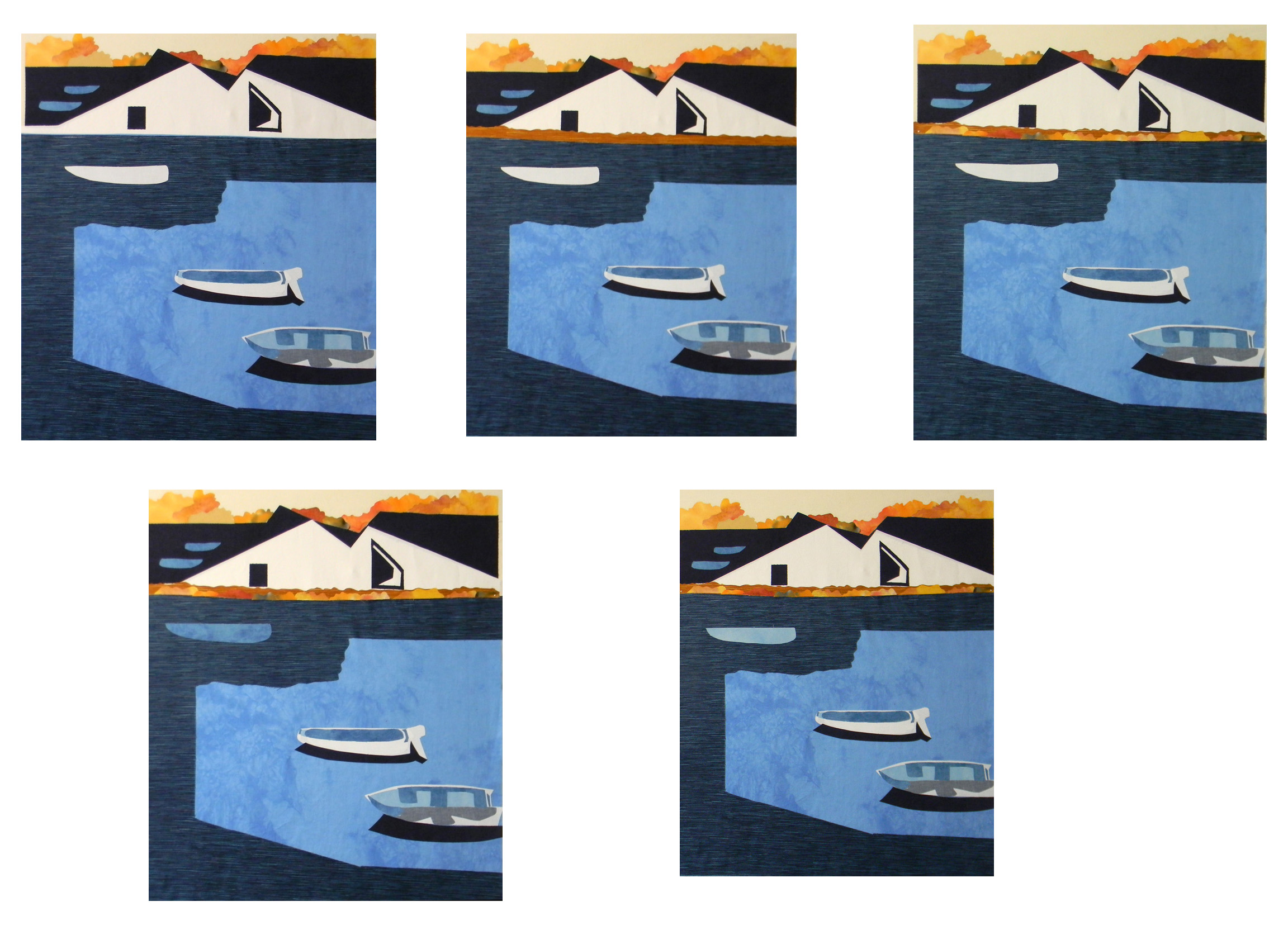
But as I progressed, I didn’t like some of the aspects of my wip. The “windows” looked more like eyes and as I fiddled more with them, I couldn’t seem to satisfy myself with corrective attempts so I referred back to my statement and thought, perhaps if I tried more to convey more of these ideas, of community, the close relationship of sea and land and the people who live and work here, I’d be able to solve my problem.
And so…back to the drawing board and I felt that I was much happier with what I came up- after all, the village architecture, the closeness and shapes of the buildings themselves almost stacked on top of one another were paramount to the idea and yet I had not given them their due. People were assembled, as they usually are, together here and there in the scene. So… after attending to these issues – that is ripping out and cutting up what I had to pretty much start over again – the rest flowed right into the cloth.

This was my first time using eco-felt (made from recycled plastic bottles) instead of cotton batting. The jury is still out as to whether or not I like it better than batting. First off, I found it to be a bit stiff, so when it bumped up against items that are usually on my sewing table, it bumped back and slowed down, so I learned to catch it before it got that far. Also, I did not use a backing fabric, as I ordinarily do. I thought the felt was quite strong and didn’t need anything to stabilize it. However, it seemed to catch a bit at times, not sure now on what…maybe the needle plate or something. I’ll pay more attention next time.

To add to the difficulty, I tried a different method of facing, but I may not have executed this method as well as I should have and I don’t like how the corners came out – just not quite as square. Next time, I’ll use the method I usually do and see if that turns out better.
I’d love to hear from others about their experiences with eco-felt, so let me know if you like using it or not.

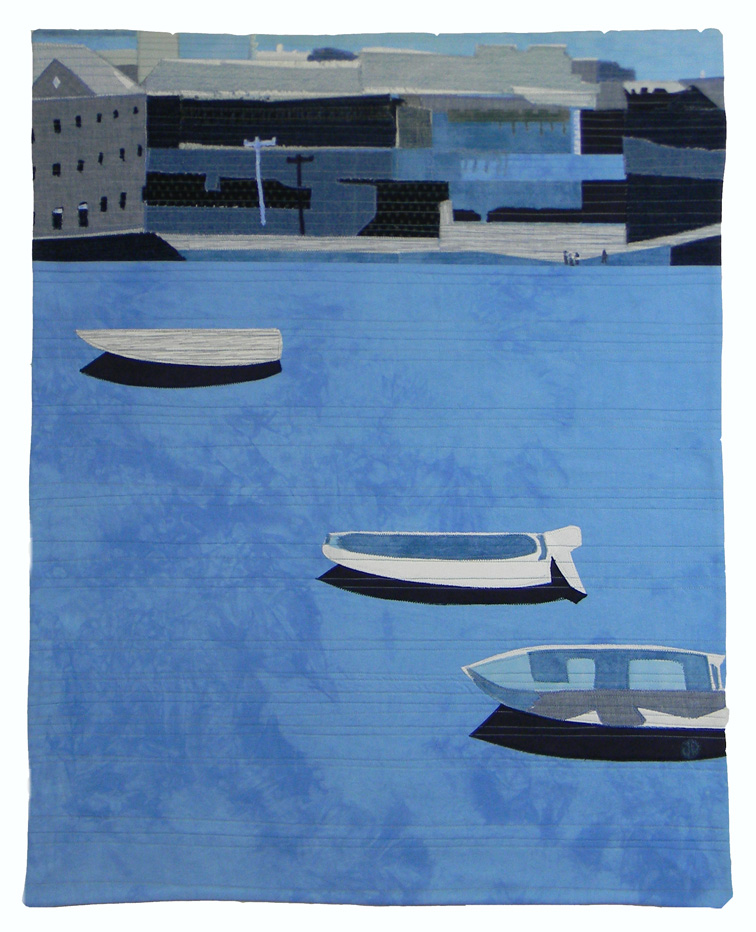
I’ve never used eco-felt, Janis, but love the redo of your design to flow with your attraction to the scene, especially the abstraction nature of the buildings, which look realistic from a distance. It also is very effective having the three boats with distinct shadows on the sunlit water.
LikeLike
Thanks Donna! Having written a statement about what I wanted to do in this pieces was really worth doing. When I got lost I had that to bring me back on course.
LikeLike
I recently used it in several small pieces to be mounted. I agree – didn’t like the feel, and when quilting it didn’t give against the throat of the machine. I’m glad I only bought a yard!
LikeLike
Well, I’ll play some more with it because I like that stiffness in the finished piece, so it could be worth adapting to….we’ll see.
LikeLike
This is beautiful Janis. I Love the calm simplicity of the water juxtaposed to the land. I Am a fan of felt for art .
LikeLike
Yes, especially recycled bottle felt!
LikeLike
Love the little people!!
LikeLike
All those blues and value changes are very effective in creating a mood. I like the graphic nature of the piece with large and small scale things to keep the viewer engaged. Thanks for sharing your design evolution…it was worth the effort! Adding more detail and emphasis to the land really balanced out the 3 boats and the sea…
LikeLike
Thanks Diana! It’s so good to get feedback!
LikeLike