It’s time to show you the third digitally processed photo of the One Four Challenge hosted by Australia’s Robyn Gosby on her Captivate Me blog.
First, when I look at others’ blogs I like seeing the progressions, so here’s what I’ve done leading up to today’s pic.
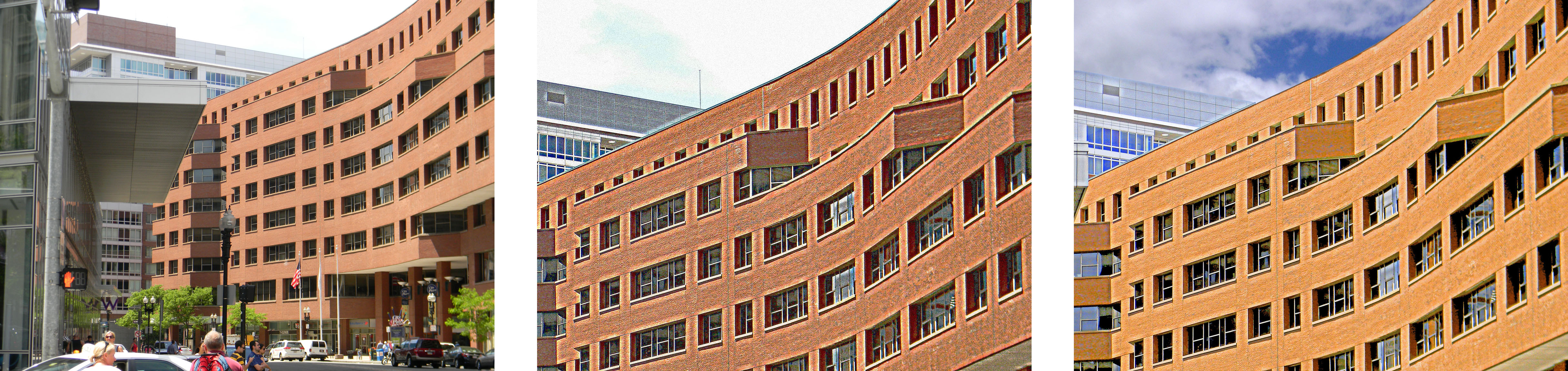
When I woke up at 4AM this was not the one I had ready, but I decided I needed to try again before posting, so….today’s a two for one, as I couldn’t decide between the 2 crops or the color saturation levels. Perhaps some of you have a preference clearer than my own.
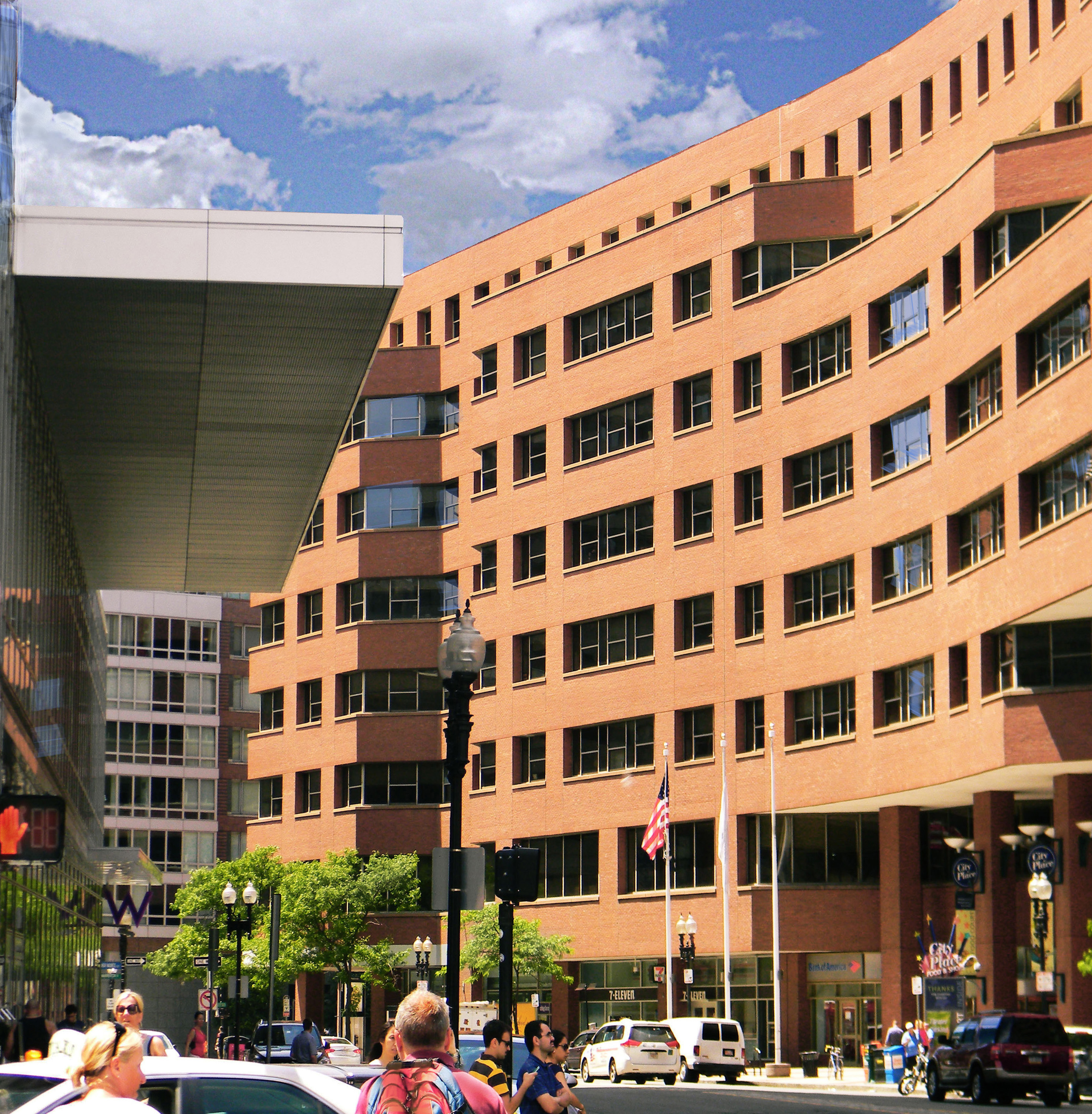
I went back to Week 2 without the crop and removed the sky that was there along with the building in the upper portion as suggested by Ben Rowe. I recreated a new sky and painted a small section that was whited out.
I Iayered the two images and adjusted the darks and lights in different areas with the curves function of PS, increase gamma and offset lightly while increasing exposure just a bit and gained a much clearer image. After tweaking the colors (also as Ben suggested) I was done…well…
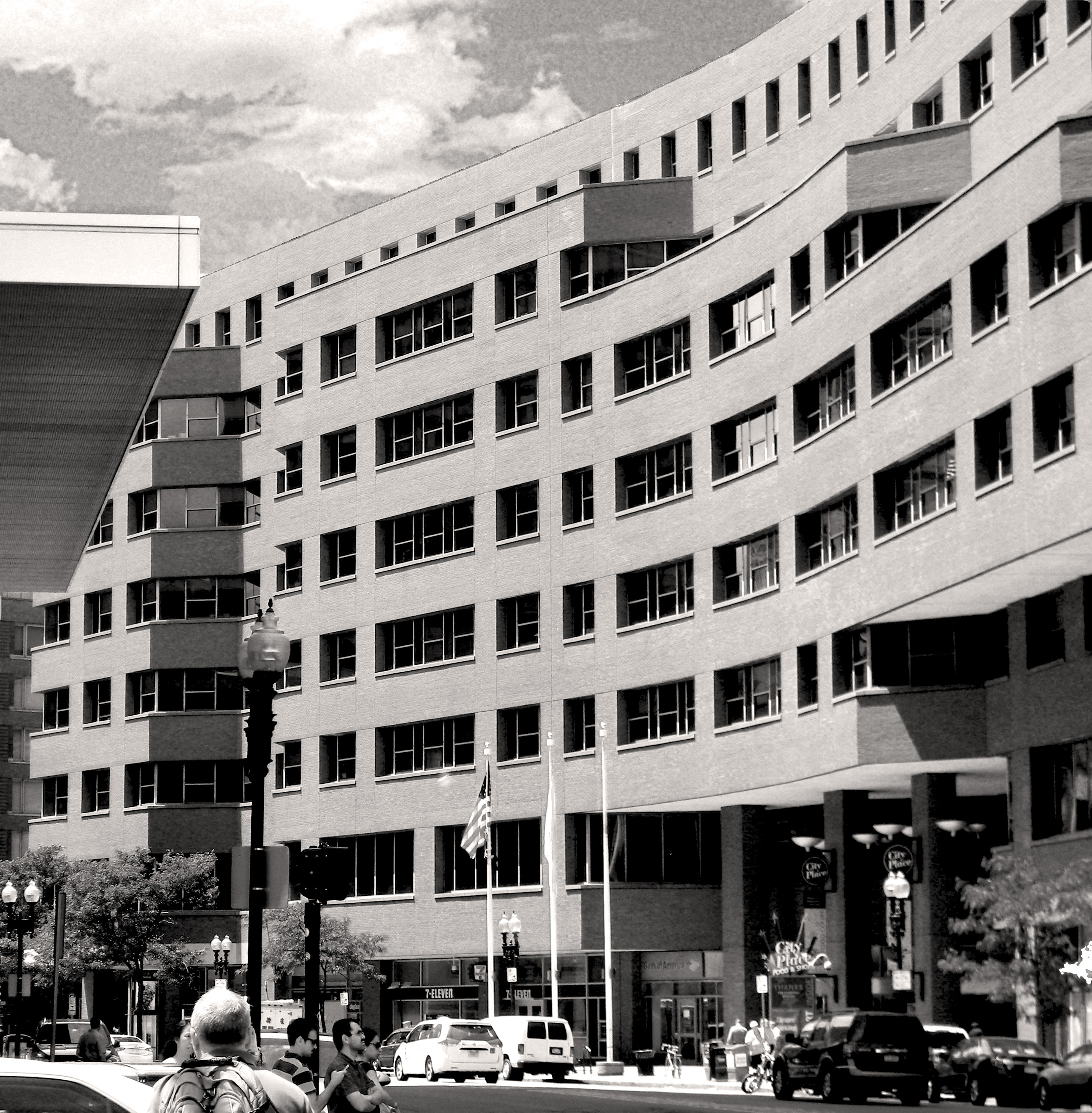
I wanted to see it in greyscale so I removed the color saturation. Funny thing, in this version there was an apparent difference between the sky and the rest of the picture so I overwrote it with a sepia tone and that appeared just fine to my eye..more unified.
In this mode, I was also not liking the crop so much so I got a little more aggressive with the cropping. Four hours later…done!
I’m somewhat surprised that, at this point in the challenge, I have no radically different images as I’m ordinarily inclined to do. (Nor that I haven’t done them – I couldn’t help myself, but I didn’t include them here.) Why? Because what I’ve learned most of all is that there’s much more to do in the first stages of editing than I thought about before. I’m learning from all of you and I love it!
Thanks Robyn for providing us with the opportunity and to all the players who have been participating and sharing all your knowledge and techniques!

Week 2 stands out to me. I can see why you have not cropped the colour version so much as the sky is fabulous. However, IMHO the left margin just needs to be squeezed in a bit in order to cut out the tall part of the mirrored building you can see just infringing the shot in the sky area. Above the flat roof I think we should just see sky. Hope that helps..and thank you for your own comments on my own site….MM 🎅
LikeLike
I cropped that color one as far as I could without taking out the red “stop” hand on the stoplight and did my best to make the top left part of the building fade out from view as much as possible but I realise now that it wasn’t worth keeping it in…(more evident in the B&W.) Thanks for the feedback!
LikeLike
I love this black and white version..the sky is great!
And you are right…there is so much post-processing details in the beginning that can be fiddled with!
And thanks for you comment on my blog…I added a reply that explains how I made the slideshow gallery….
LikeLike
Oh thanks Marsha! I’ll hop on over to check it out!
LikeLike
Im not a fan of the replacement sky, it looks too pixelated compared to the rest of the image, the texture was noticeable in the BW image.
I prefer the BW treatment this time round, tho what you did with the colour was also good, I just like how BW shows the lines and gives you a chance to notice the other details, like the car and people at the bottom of the image, its not overwhelmed by all the orange brick 🙂
LikeLike
I hear you! I won’t be doing another orange brick pic for the last one! Enough is enough! I do like the B&W one best but I couldn’t tell this morning if I was just sick of the dang brick color!
LikeLike
I like the BW version too. It makes your eye move through the image more, the color makes me get stuck on the building. It sounds like you really worked on this image, way to put in the time. That deserves some great recognition.
LikeLike
Thanks Carrie!
LikeLike
Morning Janis – Ah I can so relate this week. Many changes and indecisions, but with a final result.
I too really like your BW version as it allows the patterns and detail to come through.
I like that you have layered the 2 together – for me this works.
Lowering the brightness and saturation is also appealing 🙂 Also I like seeing the bigger picture – something I have wondered about.
This is a great learning platform – all of us are learning and gaining new ideas and skills along the way.
I think this week has been successful for you and certainly a learning week for us both 😀
LikeLike
Yes Robyn, in the end, the B&W photo is cleaner. Compared to the color version, which seems way too busy, you’re able to appreciate the whole scene without distraction.
LikeLike
So good to have room to experiment Janis.
I was happy to see your 2 this week to see the amazing differences!
Keep doing what you’re doing 😃
LikeLike
I too like the B&W, it seems cleaner, but the sky is a little odd, not in keeping with the rest of the image. What a lot of work! We become quite unaware of time when we work on images, don’t we. It is fun to experiment and as you say, we learn a lot in the process! Chris
LikeLike
Yes, this sky is somewhat turbulent and doesn’t work here – I totally agree. And you know how it goes: time flies whether you’re having fun or not! It is fun though to me.
LikeLike
B&W definitely, it seems to define the details more and I noticed the people for the first time in the B&W not the orange brick one. I still like the Week 1 & 2 crop best.
LikeLike
Yea, there’s just so much going on in this shot, it cries out for some serious limitations, which both the closer crop and the B&W succeeded in doing. Thanks!
LikeLike
Notwithstanding the comments by those with more expertise above, I would vote for the colour version for this week marginally over the B&W. The adjustments to the sky helped I think as the other building was distracting, but I feel the building needs some more contrast or definition in the B&W pic as it takes up so much space in the photo itself but do agree that in the colour version, the activity at the base of the photo is less distracting in the B&W version. Just my thoughts.
LikeLike
Thanks for your comments! And I think you’re spot on there – I also think the B&W needs to be more defined.
LikeLiked by 1 person