Since I felt under the weather this week after oral surgery I wanted to just play with some new designs. Using only scraps for this exercise, I first drew up some initial sketches (which, unfortunately, I already crumpled up and tossed) and began to lay out the pieces on pieces of 3″X4″ quilters grid. I got a little carried away but I guess that was the point, after all. (This is not all of them.)
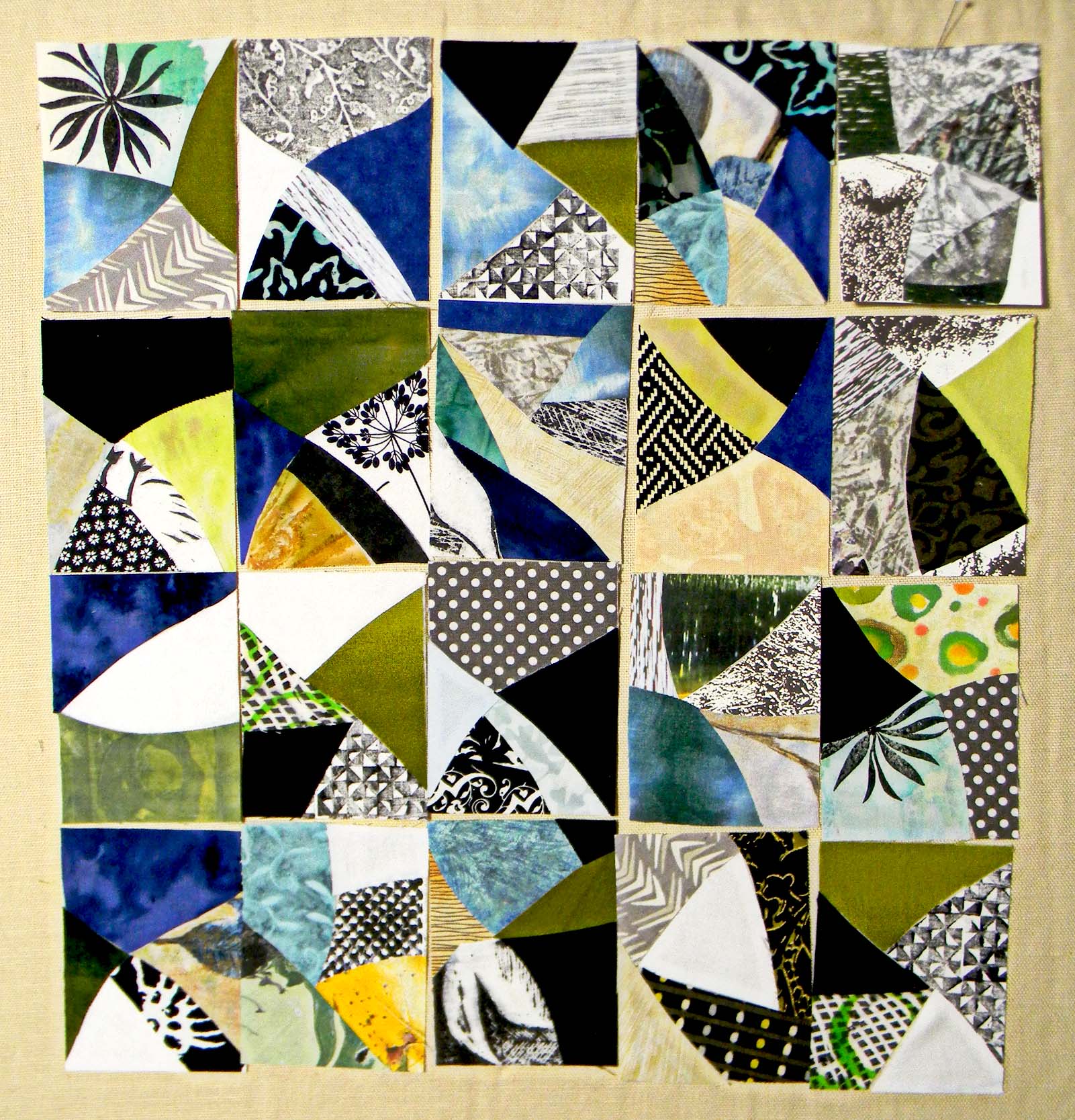
I liked some more than others and studied them until I picked out the ones I liked the best and did some more of those:

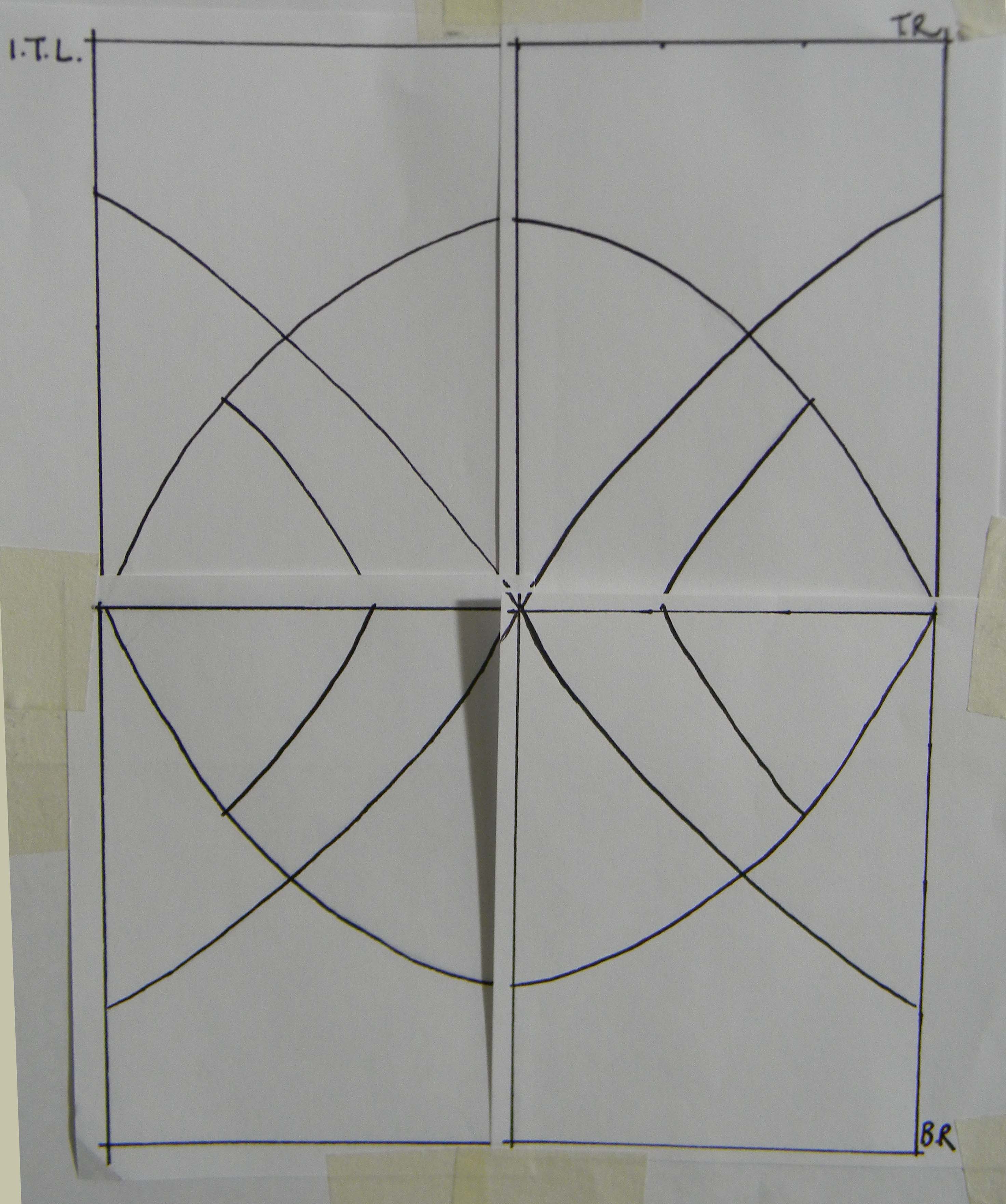
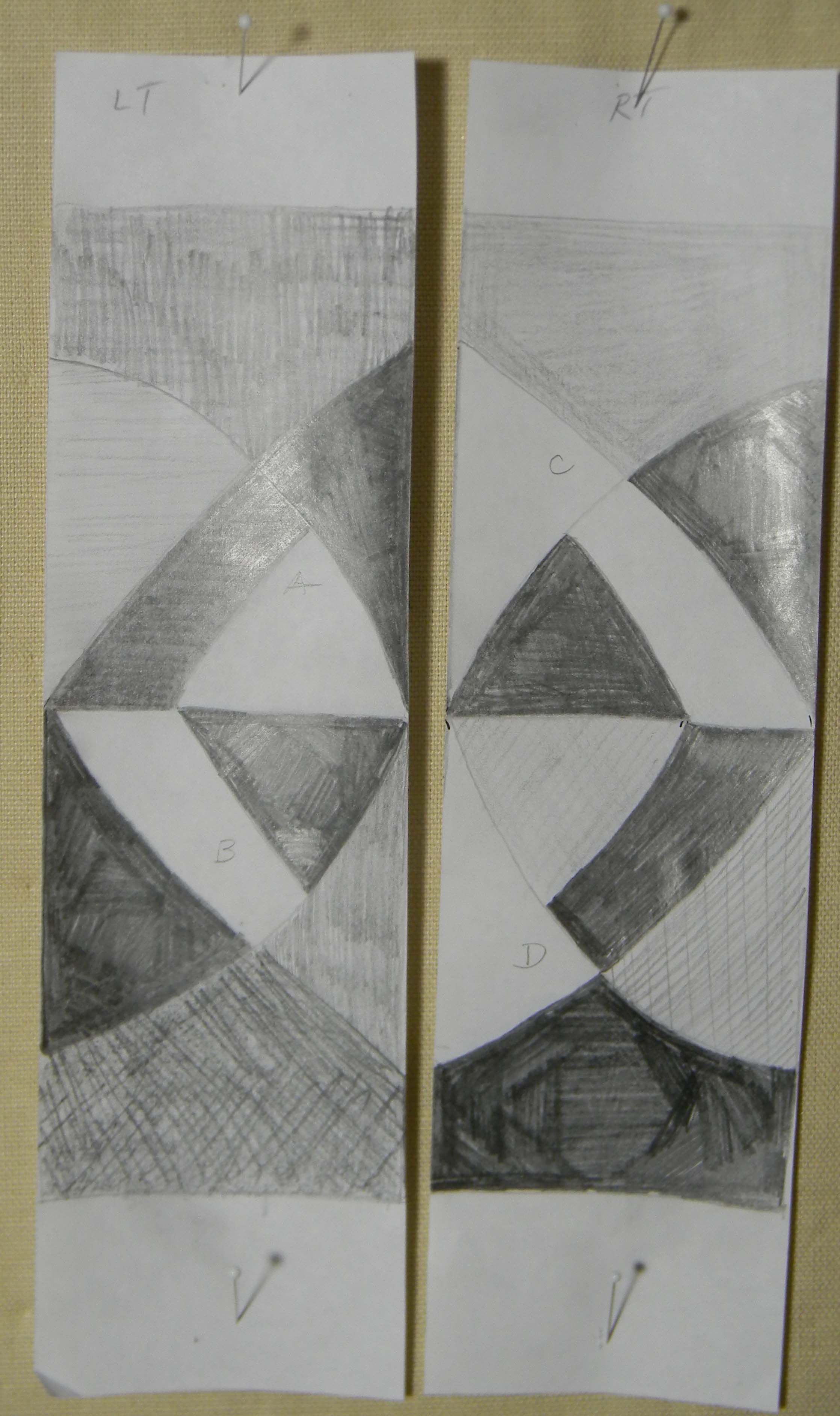
I played with a lot of arrangements to discover a pattern I favored and refined the design just a bit so that each one met where I wanted it to when they were put beside and on top of one another for this design.
I strategically placed lights and darks to what I think is the best advantage
I kept the palette neutral so as not to complicate the design and here’s what I came up with for a final choice:

I drew up some more designs for another time. And boy, do I have a mess of scraps to pick up now!
I almost forgot to link up with Nina’s Off The Wall Friday blog.

The final design is really striking.
LikeLike
Thanks Maggi! Next, I’ll use this design with some of my hand made fabrics.
LikeLike