A good summer Friday morning to you! What great weather we’ve been having here in the northeast corner of the States – perfect to be working out in the fresh air and sunshine! Besides power washing the deck and plastic shed, most of what I’ve been working on these days are Deconstructed Screen Prints. After I did this one, I thought it needed some more contrast to break up all the monotonous pink.

So, I pulled out my Inktense colors and added some golds and some dark blue into it and I like it much better. It’s actually softer than it looks in the photo below.
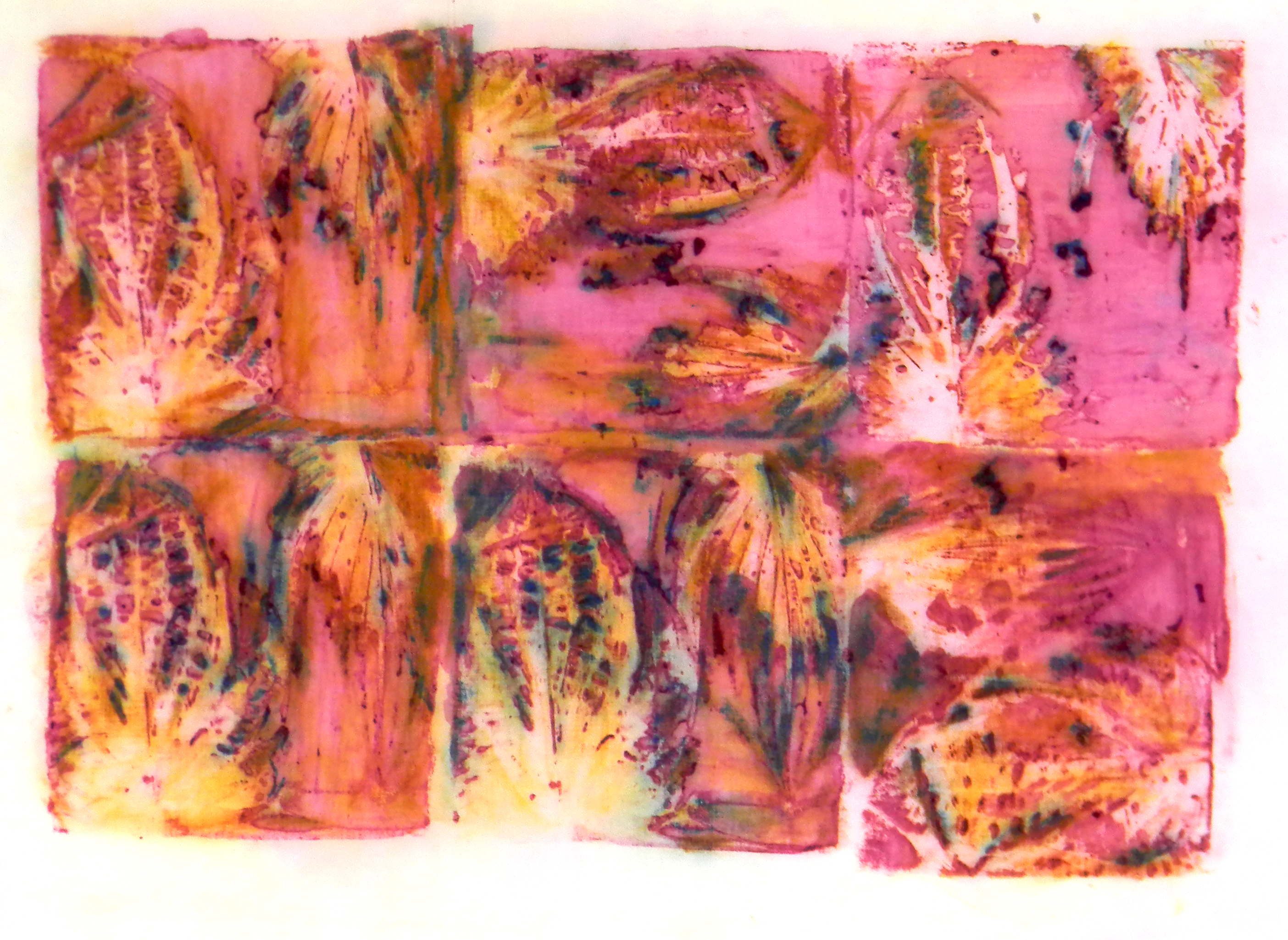 I’ve been looking over what I’ve done so far and have 5 piles. 1. to be over dyed or paint dye in; 2. to be overprinted; 3. good sections that will be cut up for collage and piecing and 4. to be discharged and 5. good as is for a wholecloth quilt. Which pile would you put this in?
Linking up with Off The Wall Friday as usual!

I would put this in the pile of “I love it and I want it to inspire a painting”! Thanks for sharing! 💛
LikeLike
Thank you! I never know until the last minute what I’ll do with it!
LikeLike
Looks great! I love working with Inktense as well. The colors are so vibrant,
LikeLiked by 1 person
I think it is ready to use! Either cut up for collage or as a wholecloth quilt
LikeLiked by 1 person
Love the colors!
LikeLiked by 1 person
I love the patterns in it, but since I don’t usually work with such saturated colors, I’d over dye it to tone it down a bit.
LikeLiked by 1 person