Hi everyone, and thank you Janis for including me in your First Friday Voices for 2016! I am a mixed media painter. I use acrylic media as a base and include a variety of other media in my work. Over the past year I’ve been exploring using texture more effectively in my work.
My hope is that texture can be used as expressively as colour, but perhaps with very different effects on the viewer. By that I mean I don’t expect to be able to produce an impression of passion using texture, like one can create that impression with the right combination of reds on canvas.
Texture produces different kinds of impressions. By the time we are in kindergarten, each of us already has a huge body of knowledge regarding how something looks and associations with how it is likely to feel. Some textures are comforting, like human skin, or a soft warm fibre like knitted alpaca socks; some are cringe-worthy, like sharp glass or thorns; and some are enticing, like smooth glass, or very short trimmed hair. And there are secondary associations as well: the texture of a teddy bear’s fur or a feather may be more evocative to some people than others depending on their personal experiences with teddies or birds.
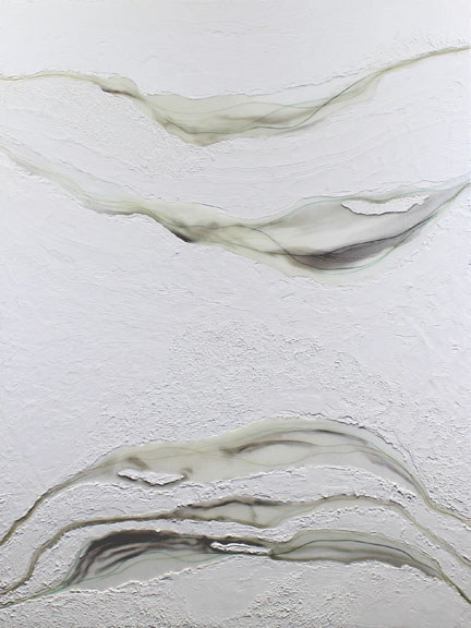
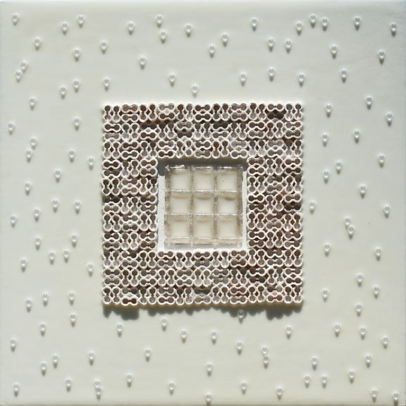
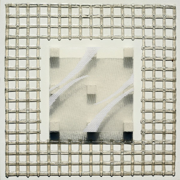
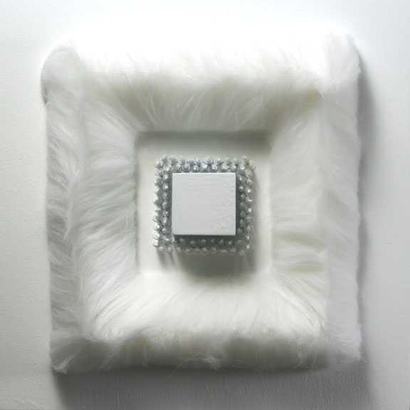
So in the hope of using texture in my own way, I set off on a series of relatively monochromatic (white and off-white) texture paintings. In the early explorations, paintings were most successful when using several textures. However, like colour, texture can very quickly get out of control. There is a balance between including enough contrasting textures to create interest, and involving too many for the composition to remain cohesive. Another similarity is that textures can get mixed together too much or be too similar, becoming muddy and indistinct. Without a clear contrast of one texture up against another, the composition must rely on some other means of creating contrast to be interesting.
After decades of theoretical and applied research, we now think of colour as having three key attributes, hue, value, and saturation, and this has allowed fine artists and commercial artists to develop tools like the colour wheel, graphic art colour pickers, value sketches, and distinctive colour schemes and palettes of colour. I’m hoping to explore texture deeply enough to develop my own tools for using it evocatively in art work. So I’ve been doing a series of studies of textures, simple square compositions, but using several textures to explore how textures interact:
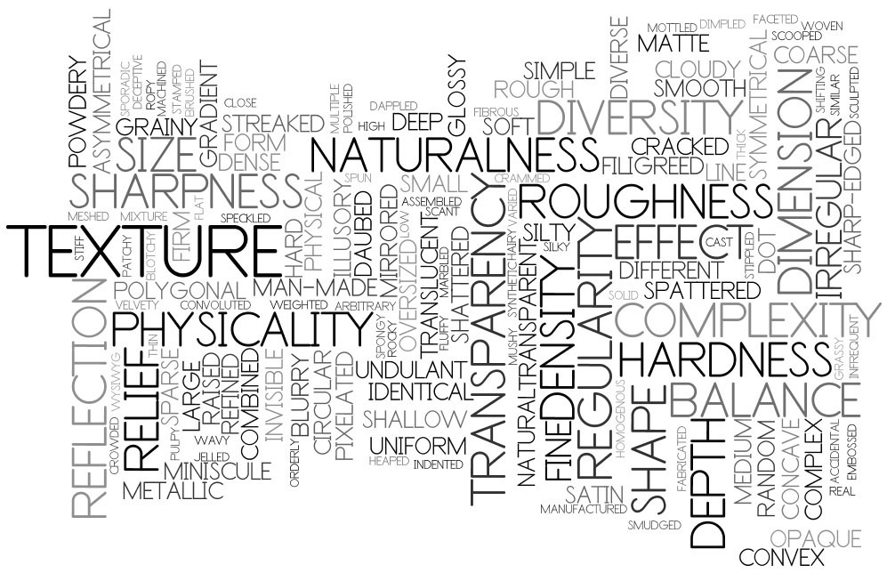
If you are looking for some inspiration regarding how you might involve texture in a new way in your own work in the future, here is my brainstorming of words related to texture. When I am at a loss for what to try next, I look up at this Wordle posted on my studio window:
Best wishes to all of you for your own explorations and creations in 2016!
Rick Rogers.
Link up: Off The Wall Friday

Thanks for your willingness to be the first voice on this new feature of guest bloggers Rick and so generous of your time on this new day of the year! We did have to work out the glitches of doing this guest post but the process should make it easier for those who will follow due to your generosity of time! Such a well written and thoughtful post too! Definitely food for thought for all of us! I love that you made this a great first day for me!
LikeLike
Thanks Janis, I really appreciated the opportunity to share and am glad you liked it. Will look forward to future First Fridays!
Rick.
LikeLike