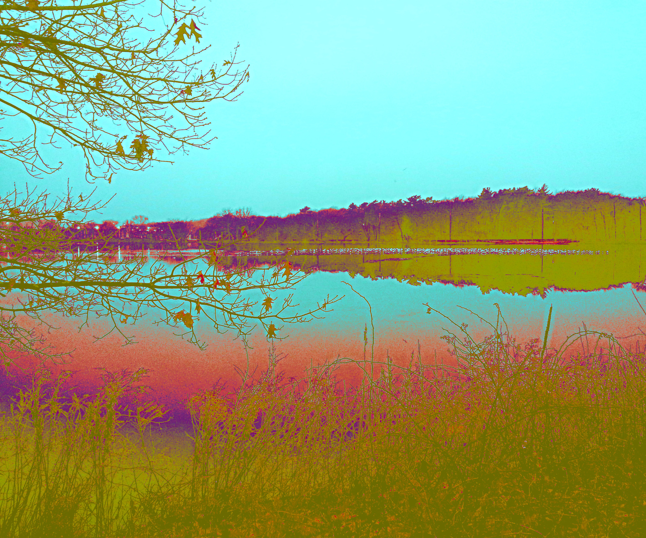
Been juggling numerous projects this week and somehow didn’t keep track of what I did. All I can tell you for sue is that it involves a couple of layers, and that I wanted it to look very different from the previous 2 weeks.
If you want to see other participants in this challenge go to Robyn’s Captivate Me Blog.

like a coloured negative effect!! Well done!
LikeLike
Thanks! I just remembered that I embossed one layer of this!
LikeLiked by 2 people
I really like this Janis!!
The use of such pure colour and ‘almost’ complimentaries makes this pop.
Simple (and yet not for you as the creator), clean and very appealing!! 😃😃
LikeLike
Hope that makes sense 😜
LikeLike
Makes sense to me! Thanks, Robin! It’s so soft, like sherbet, so I like it.
LikeLiked by 1 person
Interesting artistic effect. I like this one best so far, Janis.
LikeLiked by 1 person
Thanks Lynne!
LikeLike
Fabulous choice of colours – I really like the way they interact with each other…
LikeLiked by 1 person
Thanks!
LikeLike
The colours are surreal but really pop! Interest effect.
LikeLike
Thanks! I love these colors too!
LikeLike
Some really interesting colours this week. It has a screen print feel to it and can imagine it in a cafe somewhere.
LikeLike
I can’t believe I hadn’t even thought of that, but now that you’ve said it, I can see it as a screen print!
LikeLike
I see the embossing and you totally achieved your aim. I admit these really bright in your face colours are not my personal preference but the point of the challenge is to experiment, and you totally won there 🙂
LikeLike
Thanks for the encouraging words!
LikeLike
I really like this!
LikeLike
This looks so weird in a very pleasing sort of way Janis! I love how those colors work together.
LikeLike
Thanks Anita! It is an unexpected combination of colors for a landscape but I think it’s weird as well that it works.
LikeLiked by 1 person