So many times I hear about the “rule of thirds” as if it’s written in stone and it’s implied that if you don’t follow it you just don’t know what you’re doing. Well, I think it’s a good thing to know but I’m not so good at following rules of any kind. After the fact, I may or may not check my composition out for these kinds of structures but when I did that this morning, I wasn’t sure if my art meets the criteria of this formula.
According to wikipedia, “The rule of thirds is a principle of the Golden ratio with broad application as a “rule of thumb” or guideline which applies to the process of composing visual images such as designs, films, paintings, and photographs.[1] The guideline proposes according to the principle of the Golden section search that an image should be imagined as divided into nine equal parts by two equally spaced horizontal lines and two equally spaced vertical lines, and that important compositional elements should be placed along these lines or their intersections.[2] Proponents of the technique claim that aligning a subject with these points creates more tension, energy and interest in the composition than simply centering the subject.“
So I decided to look further into it and I imposed a Golden Grid over a few of our most famous works by master artists.

Perhaps, of those I selected, Anchen’s Woman In The Kitchen most closely follows this rule. She places the center of interest directly on one of the intersections and her feet are grounded pretty closely to the bottom horizontal line.
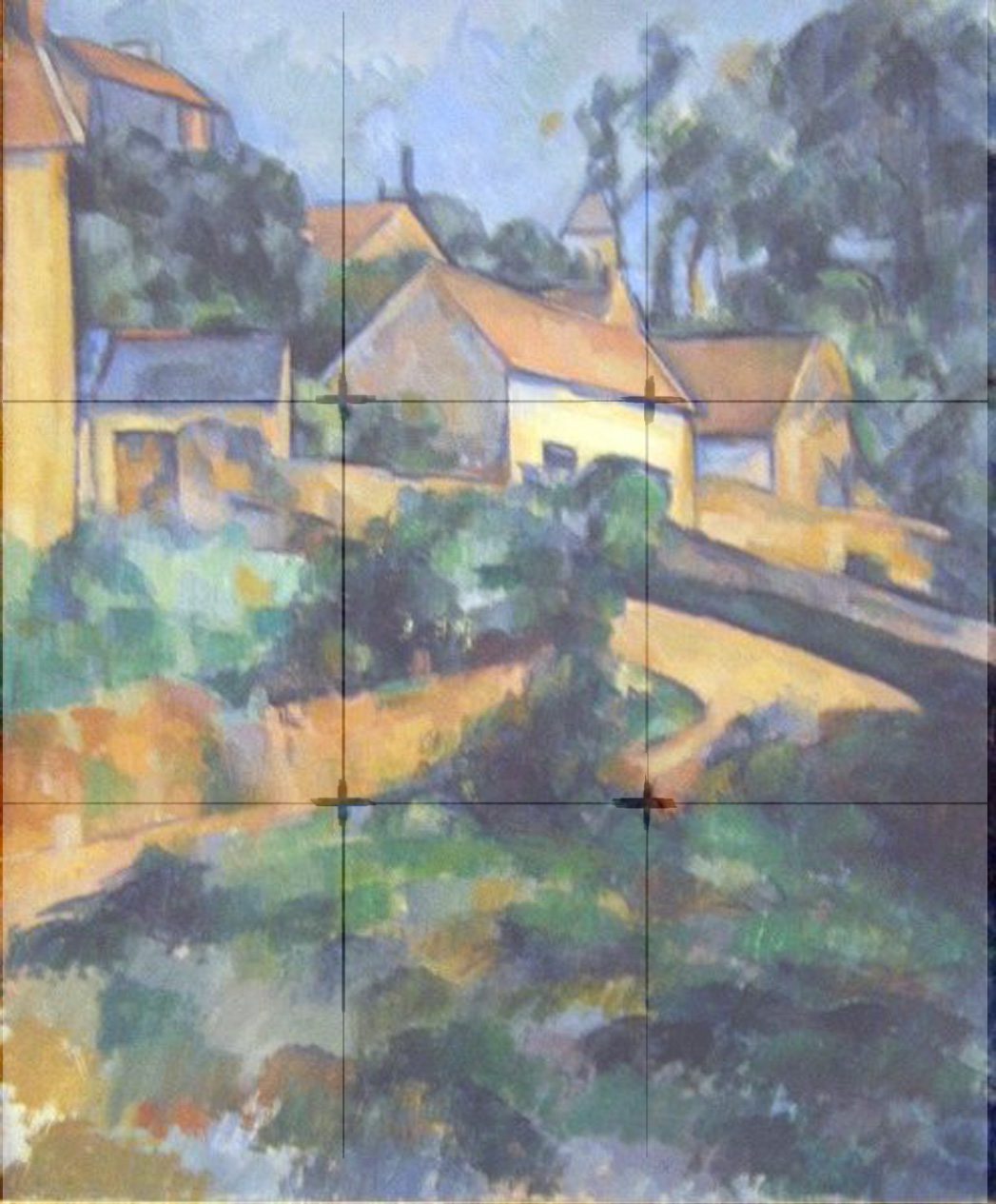
Most landscapes seem to conform to the most basic rule, the horizon line is at one of the two horizontal lines of the grid. The horizon line of this Cezanne, Turning Road At Montgerault, is pretty close, but I don’t see any of the points of interest at or near any of the four points on the grid. The main house is actually pretty centered.
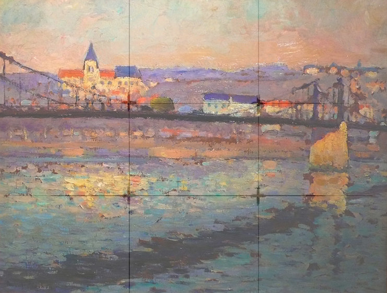
Again, Pinchon places the Triel sur Seine directly on the top grid line and what appears to be the center of interest is also directly on top left sweet spot.

Van Gogh places The Sower near enough to the left vertical line and near enough to the same sweet spot on the golden grid. The horizon line does not conform. Here, it’s at the center of the composition.

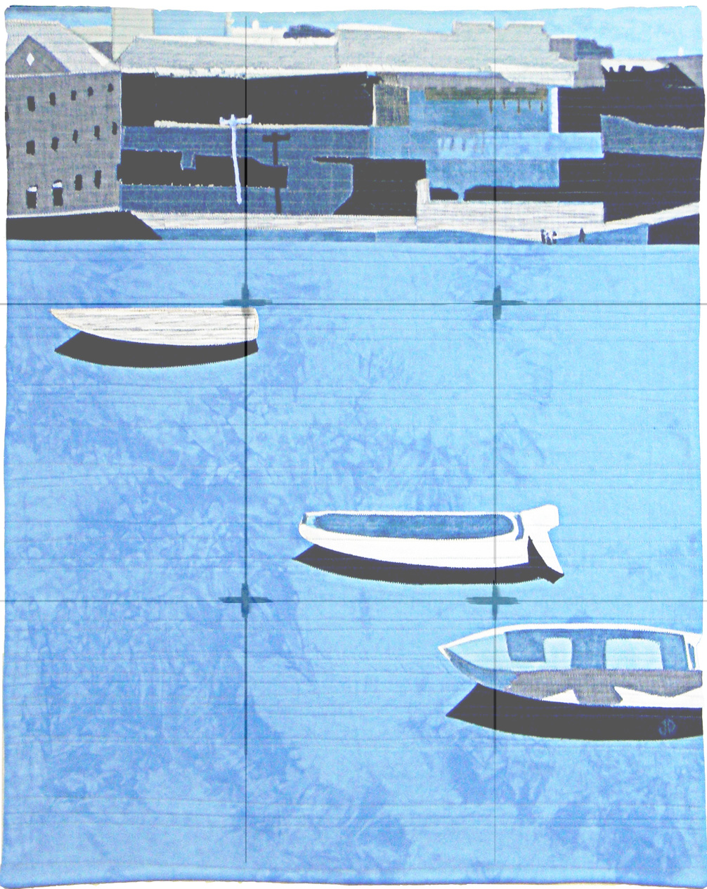
What to make of Wray’s Orange Building though in terms of the golden rule I’m not sure. Aside from the bottom horizon line, everything’s just a little off, not quite close enough to say it conforms.
What do you think? Do you follow the Rule Of Thirds?

I think I’ve done this for so many years that it is second nature. It must have been one of the first art lessons on balance. In Wray, the slice of dark on the right and left balance the Orange building but his “little bit off”, creates even more tension in the piece.
LikeLike
I see the dramatic tension between the darks along the bottom vertical line with the orange house – also between the somewhat blurred depiction of most of the composition with the highly contrasted orange house but I don’t see that it related much with the rule of thirds.
LikeLike
Ah…guess I got in a hurry on that comment. And the orange house isn’t smack dab in the middle, the right wall closely runs along the line. The rule doesn’t say it must be exact, but that the focal point should be close to one of the points. But as you know, rules are made to be broken. If you have completed a piece but suspect something is just off, you can trick the eye by adding another element rather than cropping off a piece. think of the added tension of the darks on both sides as opposing magnets pushing and pulling that house to their side. Sometimes a little off is balanced by creating tension and interest in other ways.
LikeLike
That was fun! You illustrated this point so well with the master’s work and grid. Thanks so much.
LeeAnna at not afraid of color
LikeLike
Glad you enjoyed it. I had fun doing it.
LikeLike
Janice, I like the idea of seeing the contrasts as magnetic pushing and pulling your eye to a certain place! And I appreciate what you’re saying about adding tension to the composite with simple placements of elements.
LikeLike
this is a test.
LikeLike
Now I see the wordpress button!
LikeLike