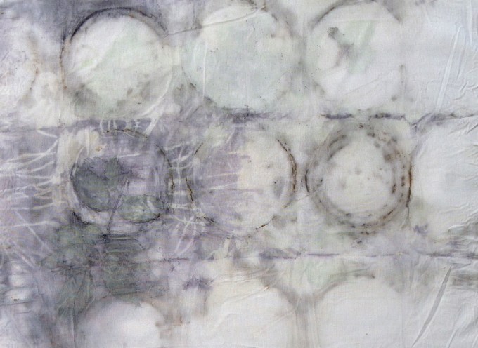
These two are from a series I’m doing, a few each week until I have enough to do something with them. I like them a lot.
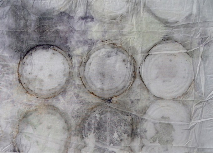
This one looks better in person than it does on my screen. I think it’s a mix of cotton and poly and it actually looks quite delicate and somewhat translucent. 
After reprinting on this one, I love all the layers and depth.
There’s more but these are my favorites.

Love these!
LikeLike
Thanks! I’m starting to be able to have a little control over the process and I’m liking them too!
LikeLike
What are you using to get the grayish blues in the first ones? They are all quite lovely
LikeLike
As far as I know, it’s the combination of dipping the cotton in rusty water and the use of tin can lids Unfortunately, these were among those that missed getting labels, so I don’t have a record of what I did. They almost certainly had some calcium carbonate in it and they may have been cooked in a batch that I added some avacado dye in because they have some tell-tale green in there.
LikeLike
Most likely it’s the tin itself and/or the use of copper in the cooking bath that causes the coloring.
LikeLike
Love the layering on these pieces – so subtle, creating a need for a closer look.
LikeLike
Thanks – the advantages of being able to reprint.
LikeLike
These are absolutely lovely. So delicate.
LikeLike
Thanks you for saying so! It’s a good part of the appeal of natural printing for me.
LikeLike