Another day to improve the saturation of some yellow dyes for willow buds. When I originally began to see this piece in my mind, way before the SAQA MARI call for art that turned into this project, I only saw willows in the summer and fall, so I thought that I would be highlighting the green leaves. But, after this project was already on its way into existence, Spring arrived and I was shocked to see (for what may have been the first time I ever noticed) that there were no green leaves – the tree was covered in yellow blossoms! So, artistic license being mine – I have decided to use both leaves and buds.
When I tested out a few cuts of the pale, yellow dyes I did, they hardly showed up. While I may want these for some choices, I need some more that will rise above the background and hold their own.
The first two were a surprise! They were previously either mordanted in titanium oxalate or dyed in weld – unfortunately, they were not marked. I very quickly dipped them in a batch of last year’s birch and sumac tannin and they instantly went to a deep orange color, which ignites a fire for further investigation. These are already washed and dry enough to take off the line to iron.
The others were a fresh dye in a mixture of weld and osage, and the other an over-dye of the same colors. There is no difference in those that were alum mordanted and those that had no mordant. But the over-dyes are a nice and deeper yellow. Although these are hopefully good enough for my purpose, I was wishing I had saved more yellow dye from last year’s goldenrod. I’m not sure if it would have kept well refrigerated or not. I’ll have to test that out this year. But I could have saved a bunch of the goldenrod to make new dye from. I may have to make another, stronger batch of dye, though, because the small amount that I used became quickly spent.
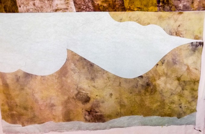
 I finished off the construction phase of the art quilt with the last panel on the bottom to represent the pond section and sewed it straight across to read as the horizon line. The color in the photo is not as good as in real life but I couldn’t seem to get it right without a properly functioning Photoshop program. It’s more of the same seafoam green as in the rest of the piece.
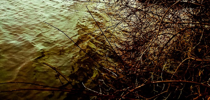
Since I’m doing a more abstract rendition, I won’t be trying to represent the details of my photo but adding in my own vision that was also inspired by these photos:


")

")
Embellishment Begins!
It was a challenge to cut the branches out so that they had the right curves in them from a limited supply of fabrics that could work. I wanted the branches that were further in the background to recede yet not disappear, so I used previously printed silk organza that I had on hand. I could not buy any more silk! Fortunately, it just worked out and I can play with that, some, using thread when I start stitching. For the branches that are more in the foreground, I used a batch of previously printed fabric that I don’t know for sure what it is, some synthetic, that was the perfect color and value that I needed. If it’s not quite perfect, again I can alter it with thread. The branches are now fused onto the foundation. I’ve also taken some of the yellow dyed fabric and ironed it to some misty fuse. As much as I wish I had a Cricut Machine, I cannot spring for it right now, so I’ve begun to cut out, by hand, the buds and leaves that will move the project along way toward completion. I’ll begin the free motion stitching next.


What do you think? Can you see it taking shape? Now, I know that some of you live for color, but we each have our own various senses of and preferences for color. But color is only one aspect of any art. I happen to love soft and monochromatic earth tones. Value is far more significant to creating a good piece of art. If this was to be a stand alone piece without overall embellishment, I would have increased the value contrasts in my selections, but I figured on superimposing another important component on top of it as I was drawing closer to my final selections. I eliminated some beautiful and colorful prints because, in the end, they would be too jarring for the final look I was after. It’s usually easier to see the value contrasts in black and white because we often mistake color for value and because, even when we know this, our eyes can deceive. In the color pic, see that patch of gold just over half way down and to the right of center? You might mistake that for a more intense value contrast but if you look at the black and white version, it disappears. There is value distinction throughout the piece, but high contrast values are small and few. I think there’s enough contrast to be interesting but not enough to distract you from what’s to come.
This is why I went back and dyed some bolder yellows! What seemed to be saturated yellows on their own, were not strong enough when placed on top of this arrangement. I will be paying closer attention to value as I stitch and embellish.

YEs! Love the tree reference photos! Awesome – cant wait to see it finished!
LikeLiked by 1 person
i’m liking this more and more
LikeLiked by 1 person
I love that you included the ‘contours of the reflections of the land on the water’. That’s perception.
LikeLiked by 1 person
Thanks for adding your take on this. I found it to be more challenging with this whole piece to tread water between representational and abstract. Because of the whole documentation process I had to “think” more than I usually do. I’m so accustomed to letting my feelings/senses take the lead and then think about it. But this was the opposite. Now, I’m so looking forward to going back to my intuitive approach but hope to improve my documenting as well.
LikeLiked by 1 person
I’m ‘documenting’ too – e.g. I’ve started keeping a ‘sample’ ledger of my dyeing attempts as I’ve too many pieces now that I’ve dyed and have now forgotten what I used! I’m trying to organise so as to maximise the time I spend actually ‘creating’ and the quality of the time, i.e. that I’m focussed on that and not a myriad of other things. Like your quilt, it’s a balancing act. I do like your work. 🙂
LikeLiked by 1 person
Good idea! I started one but in the flurry of activity I couldn’t keep up. I will be resuming this practice. I’m working on a sample book now for the exhibition that will include some of them.
LikeLike